Our Thinking: Landmarks versus wayfinding signage
Meet you the world's largest flower sculpture, Puppy, by American artist Jeff Koons.
A wayfinding system is composed of many things. People tend to think about the typical elements, most obviously, signs.
But in our world, signs are the very last resource we want to use.
As wayfinders designers, our job isn’t just to point you in the so-called ‘right direction’. The core of our job is to make the space as legible and recognisable as possible.
There are plenty of powerful tools at our disposal we can use to enhance this, way before we even think about signs.
One of these tools is the use of landmarks.
Local knowledge and landmarks
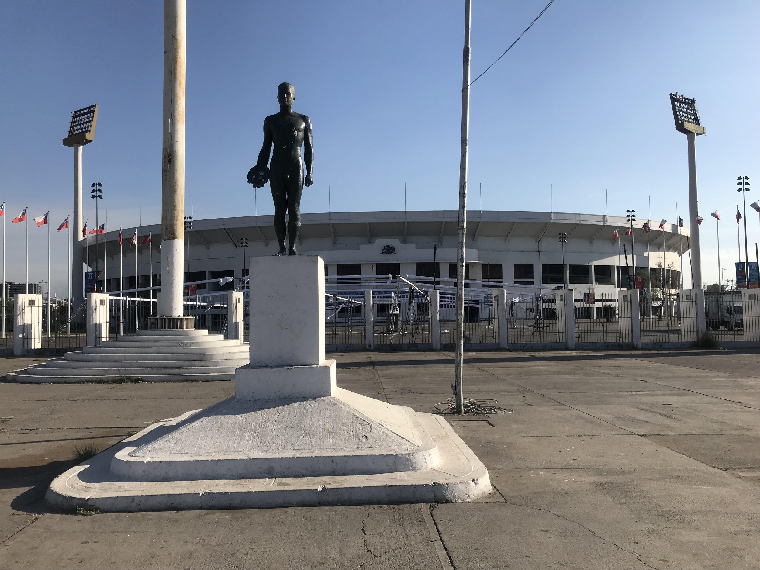
I’m originally from Chile. In Santiago, when you arrange to meet someone at the stadium you won’t simply say ‘meet you outside the stadium’. We’ll likely meet at the ‘naked man’.
Meeting a friend in Santiago for a game? They’ll likely tell you to head to ‘the naked man’ right near the stadium
The ‘naked man’ is a tall classic bronze statue, and is by far the most iconic reference point in the area.
Yes, you could ask someone to meet at some street crossing. But the naked man's landmark was ideally located and designed: you could stand there without obstructing any major circulation path, and everyone instinctively knew what you were talking about.
In my adopted home of Melbourne, meeting ‘under the clocks’ at Flinders Street Station serves a similar purpose. It’s centrally located, undeniably iconic and recognisable, and rich with local knowledge.
Every Melburnian knows what it means to meet ‘under the clocks’
I’m sure your town or city has some remarkable – or equally, unremarkable, yet charmingly local – places that everyone just understands and recognises as meeting landmarks.
They’re a powerful resource, especially for us wayfinders who are looking to capture and maintain your attention.
Landmarks as guides, markers and ‘wrong way, go back’ signs
Landmarks have a great capacity to make a user journey more memorable and enjoyable.
They are also an excellent opportunity to include artworks, create a connection with the community, or reinforce a local or cultural narrative.
Let’s apply this to a typical wayfinding problem.
Say you have several entrances to a facility. You should provide each of them a name or number so users can differentiate them. But simply numbering each entrance is fraught with potential confusion.
Which entrance should be the first one?
Do the subsequent entrances go clockwise or counterclockwise?
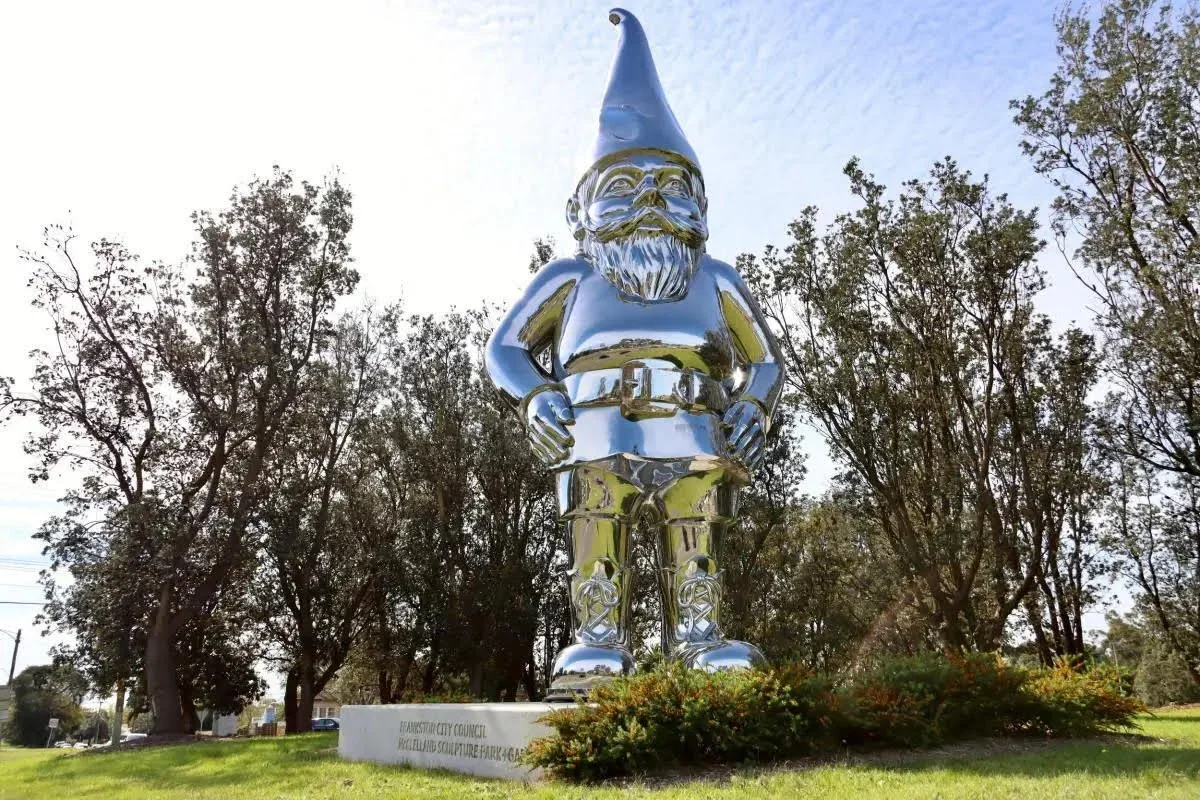
Including a landmark may be a more sensical way to reinforce this differentiation that is more intuitive and memorable for the user. It’s even better if the landmark somehow connects to the intended destination name, for example, through colour or form.
Instead of marking the ‘blue entrance’ with an easily overlooked blue sign, why not make the landmark something easy to remember?
Maybe use a blue whale, or in this case, a blue snail as your landmark
A giant blue snail is surely easier to find and remember than a nondescript door with a blue sign. And if on your way out, you see a bird sculpture instead of the expected blue snail, you might wonder if you have taken the wrong path. So landmarks can be very helpful in finding your way back, as well as forward.
Landmarks as transformative wayfinding
Landmarks can have a transformative effect on an otherwise dull or plain environment.
They can provide character, identity and recognisable features that might have otherwise been overlooked in a landscape.
By using nameable landmarks – from ‘the clocks’ to the ‘blue snail’ – to create something memorable in the user’s mental map of a space or place, they can be included physically in map and directories, and referred to verbally for giving directions.
Landmarks form an essential part of our user experience thinking, especially from an environmental psychology perspective. And, of course, if you can make users smile through your landmark, even better.


