Our Thinking: The essential mutation towards wayfinding design
What is our super power as wayfinding designers? Giving each user the ability to find and then follow their path
Our French colleagues recently wrote about their 20 year journey from signage designers to wayfinders. ID-LAB France wayfinders Loic and Valerie eventually found their way to wayfinding, but the path wasn’t always straightforward. Read on to hear their story.
The why & how of wayfinding design
We have been visual communicators for over 20 years. In that time, we’ve worked primarily as signage suppliers and designers. For us and our clients, this meant our role seemed straightforward: to design and produce signs that had to adapt to a space, to a building, to describe it to make it understandable and thus solve a simple and known problem.
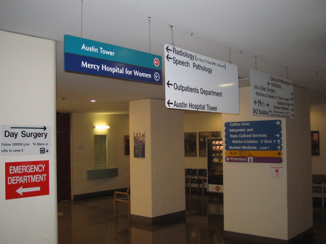
Like others in our field, we used the same tired and true signage recipe. We used arrows to indicate movement, pictures and symbols to situate, and design to make it pleasant. Through all our attempts at ingenuity and innovation, one constant remained: while the signage seemed perfect, we had the feeling that something was wrong, that something wasn’t working.
Over the past two decades, we have designed signage for a dozen hospitals, more than a hundred nursing homes, and several clinics, including the largest in France. We have also worked on university campuses, schools, convention centres, and more.
We have changed our way of working, the way we design signage, the way we manage a project as a whole, and we have integrated the latest technologies. But in the end, no matter how many arrows, signs, screens, bollards, we – and therefore our clients – still had the same problems.
People were getting lost again and again.
They still had the same difficulties to make sense of the environment in which they were located and therefore to find their way. And clients would come back to us or other providers begging us to finally provide an answer to their orientation problems.
We were determined to find a solution once and for all. However, getting there would not be easy. We would have to explore many avenues, overcome many obstacles, and work our way through many dead ends. At one point, one thing became clear: the day we admitted that the signage we knew was outdated, completely "has-been".
We didn't know at the time that the answer to these problems – which was our true destination, our professional vocation – was a much more elegant answer to wayfinding problems: Wayfinding design.
Dead end #1: More and more signs
More signage ≠ a clear path
In many ways, you could describe us as “reformed signalers”. My own reformation took time. When I took over my father's business, I first had to understand the art of signage, and then signage. This meant understanding the product in the most technical sense possible, what it was made of, how it was constructed and what it should look like when finished.
As a signage supplier, we focused on making information carriers, various and sundry signs to solve a known orientation problem. When people were still disoriented, going the wrong way, we installed new signs, other arrows. But the staff was constantly asked to provide orientation information. So we added even more signs.
Our business model depended on the sale of more and more signs and plaques, which paradoxically perpetuated and accentuated the problem of orientation for users. I began to see the root of the problem. The more signs we installed, the more our customers ordered, the more effort the user had to make to find their way, having to decode more and more messages in a jungle of information and descriptions.
Installing more signs was definitely not the right answer. So we turned to other avenues.
Dead end #2: Always more technology
We don’t necessary need more technology to find our way
Since signage is still our preferred tool for addressing user orientation issues, we turned to a seemingly obvious solution to improve it. Architects, builders, technical and communication departments all pointed to the same magic wand: new technologies. They would obviously solve all these orientation problems.
So began the onslaught of digital tools to accompany our signage. We saw dynamic signage, mobile applications and even augmented reality progress to try to solve the problems that physical signage alone could not. In 2010, we created our own digital solution based on the use of QR-Codes: "Welcomee". Designed to improve the circulation and the movement of users in a space, the web application "Welcomee" had an ephemeral but real small success. The dynamic application and the static signage were combined in a single solution to help users navigate in the space.
While our hybrid solution helped answer the "What," "Where," and "When" of the user navigating through locations, it did not answer a key question: the "How." How do you get to your destination? How did users naturally move through a space? How and why did they find their way or not?
Although our signage programs always seemed to be perfect and were even awarded for their innovation, the doubt persisted. I began to think about other notions: Who were these signs and their messages really for? What was their real function? Why did we assume that signage was necessarily the answer to wayfinding problems?
I realised that we were all – architects, designers, graphic artists, suppliers and clients – looking in the wrong place. We were all looking at blueprints, buildings, walls, doors, and signage to find the answers. We had to reverse our thinking to finally start looking in the right place. In reality, we were starting at the end. We were starting with the answer when we didn't know the question, the user's question!
We had to take a new approach, change our perspective.
The right answer: the wayfinding design according to ID-LAB
By starting with user first, we forged a new path
It is by recognising that we are asking the wrong questions that we can then ask the right ones. Why doesn't more signage, more mobile apps, solve the traffic and wayfinding problems of our clients and their building users?
Because signage, whether physical or digital, is only part of the solution. It can describe a place, but it can't guess the "why" of the user's journey in that place. Even if you place the most beautiful arrow in the user's supposed path, you are not helping to solve the core problem.
In the end, the answer was quite simple: we weren't taking the user experience into account in our solutions. For nearly 20 years, we had been trying to force users to follow paths that didn't feel natural to them. Instead of describing places – the only thing signage can do – we had to start with the user and why they came, how they perceived the space and how they moved through it.
It was when we realised that enhancing the user experience - not describing the space - had to be the focus of our thinking that it became clear that signage as we knew it was outdated.
Although we were "only" a signage provider, we were always looking to do more: to orient the user, to provoke their movement, to initiate and accompany their journey to their destination. We were always looking at the whole environment to try to improve his journey, especially in very stressful places like hospitals. We then realised that we were not just signage providers. We were designers of spaces that would allow people to move around smoothly and intuitively.
In simple terms, wayfinding design allows each user on the move to always be able to answer these 3 questions:
Where am I?
Where am I going?
How do I get there?
Finally, it was by meeting Michel Verheem and by assimilating the methodology so specific to ID-LAB that the Wayfinding design imposed itself as THE good answer. With ID-LAB, we found what we were missing all these years. The approach that definitely allows our clients to welcome and orientate their visitors, their patients, and their customers.
The paradigm has changed. By adopting the user's point of view, we radically improve the usability of places. We are no longer designers of descriptive signage – which forces the user to seek his way – but experts in user-centred wayfinding strategies.
As ID-LAB wayfinding strategists, we have a super power!


