Our Thinking: Making the pictogram accessible
As the old adage goes, a picture is worth a thousand words. As a designer tasked with creating directions and spaces to help people find the right destination, I would agree with this well-worn cliche – especially when it comes to pictograms.
Pictograms are an effective and versatile communication tool. They also offer many advantages over other more wordy or cumbersome forms of representation. Using simple graphic symbols, they can represent objects, ideas and more complex concepts, all while using less space than written forms of communication.
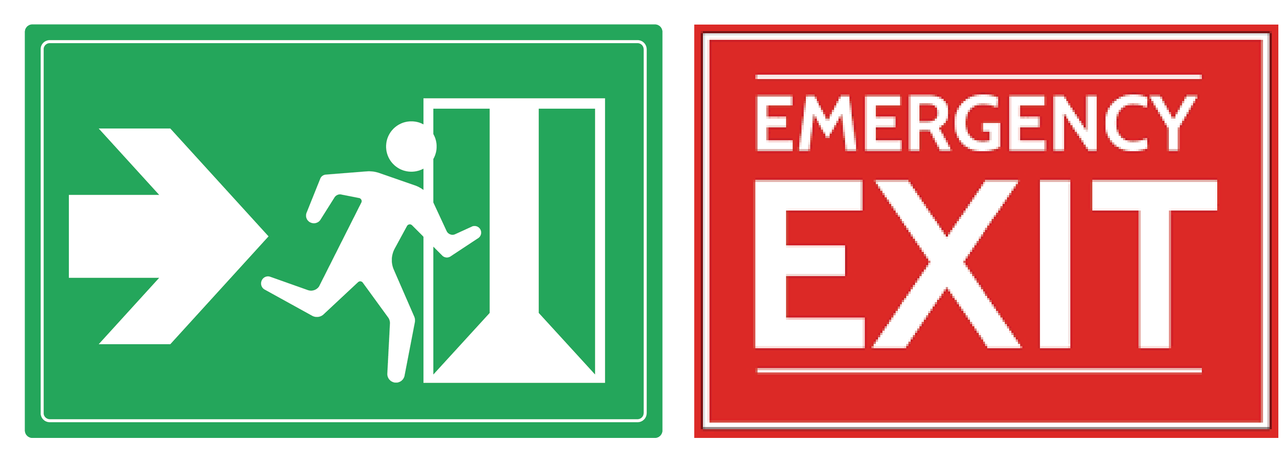
Being able to be understood across language and cultural barriers is a definite advantage, especially when we’re designing for public spaces used by the entire population. They’re often easy to remember as well, especially when compared to longer, more verbose instructions or directions. They’re also quick to process by the human brain. For example, it’s much easier to take in an emergency exit running man than the entire phrase ‘Emergency Exit’, particularly when time is of the essence. They also tick the increasingly important accessibility box, with pictures skipping many cognitive and visual barriers.
While they may be all these things, increasingly I’ve noticed something they are not: neutral. Perhaps the most significant example is the gender neutral bathroom issue, a debate that has waged throughout workplaces, schools and public officials’ offices for some time now.
When we’re designing signage for a client, we’ll often have a lengthy discussion about icons. While all gender is a tricky signage one to solve, the simplicity of the WC icon is often an acceptable solution.
Then we get to the signage for the parents' room, another decision making point that stimulates a fair amount of discussion. How do we account for the non-heteronormative family? How do we accommodate a single father with one child? Does this differ to the single mother parents room? What if there are two male parents? These are just some of the questions we ask ourselves and our fellow designers. We haven't found the best answer yet.
Amongst all the frequently used pictograms, one has been updated to be more suitable for these socially cognisant times. Nevertheless, the discussion around this pictogram makes me particularly agitated.
Confession: I hate the stupid official accessible icon (first on the left below).
There’s many reasons for my dislike of this pictogram. For one, it seems very dehumanising, appearing more like a collection of sticks compared to the other pictograms involving human beings. While this might sound overly critical, these things matter. Representation is relevant, even down to the way we communicate complex notions in picture form.
I feel especially disappointed every time an accessibility consultant calls to use the official stickman official accessible icon. Not only because they are playing it safe, but also because it disregards the advances that have been made regarding this pictogram thanks to accessibility advocates.
The most recent edits to this pictogram do not depict a barely human figure static in a chair. Instead, the more modern version of the accessible icon shows a figure in motion, somebody active and capable of moving according to their own desires. It transmits more humanity and assists with tearing down the often subconscious ableist judgements some may have around disabled people. If we continue to use outdated dehumanised pictograms of those with mobility issues, these stereotypes will only continue to the detriment of our spaces and communities.
For such a powerful device as a pictogram, we should revise what we are using and what exactly we are communicating with them. So please, Australian standard people, update your old-fashioned norm book and make sure we stop using that stiff icon.
After all, no one identifies as a stick figure, nor should they feel they have to.


